AI design generators are rapidly evolving, but most of them solve one problem: they create beautiful pictures. They fail to address another, more crucial detail: these images often cannot be used for serious work. Text appears as gibberish, typography is unreadable, and layouts are uncontrollable.
Seedream 4.0 by ByteDance is the exception. It's not just a pretty image generator. It's a tool that understands design structure: how to organize elements on a page, how to align text, how to maintain hierarchy, and how to create professional compositions.

| Parameter | Value |
|---|---|
| Company | ByteDance (creators of TikTok) |
| AI Type | Type Multimodal image generation |
| Specialization | Poster design, infographics, marketing visuals |
| Maximum Resolution | 2K (2048×2048 pixels) |
| Supported Languages | English and Chinese |
| Key Feature | Structural design (typography, composition, layout) |
| Editing | Non-destructive (Natural Language Editing) |
| Ideal For | Posters, infographics, banners, marketing, branding |
| Price | Free plan + paid subscription |
If you've tried Midjourney, DALL-E, or other AI generators, you know their main limitation: they create beautiful but unpredictable images. Text on them looks like typos, typography is random, and layout is impossible to control.
Seedream 4.0 works differently. Its architecture is built not for maximum creativity, but for maximum structure. This is a fundamental difference.
When you generate an image in Midjourney, the system thinks: "Make it beautiful, expressive, artistic." When you generate in Seedream, the system thinks: "I will follow design rules - hierarchy, alignment, composition, readability."
It's like the difference between an artist who paints what they like and a designer who creates a layout based on client requirements.
| Aspect | Traditional AI (Midjourney, DALL-E) | Seedream 4.0 |
|---|---|---|
| Focus | Creativity, aesthetics | Structure, hierarchy, design logic |
| Typography | Weak, often unreadable | Strong, professional |
| Layout | Random, unpredictable | Precise, controllable |
| Text inside image | Almost always errors | Clear and correct |
| Usage | Inspiration, special effects | Publish-ready result |
| Editing | Need to redo from scratch | Non-destructive editing |
| Resolution | Up to 1K | Up to 2K |
| Composition accuracy | Low | High |
ByteDance released Seedream 4.0 at the end of 2024 with significant improvements:
There are several AI tools for design. Let's see how they differ:
Seedream wins in one critical area: it creates results that can be used immediately, without additional work in Photoshop.
Understanding how Seedream works will help you write better prompts and get the desired results. You don't need to be a machine learning expert – just grasp the basic logic.
Under the hood, Seedream runs on an architecture ByteDance calls a multimodal transformer. This means the system processes several types of input data simultaneously: text, images, styles, references.
Unlike models that "only think about pictures," Seedream "thinks about design": it understands what layout, typography, composition are and how to organize them correctly.
When you send a prompt to Seedream, the system goes through three main stages:
Stage 1: Prompt Understanding
The system analyzes your description and extracts design categories from it:
For example, if you write "Travel poster, headline 'Discover Japan' centered, Mount Fuji in the background, calm colors," the system understands:
Stage 2: Design Grid Creation
The system creates an internal "design grid" – like a designer who first sketches block placement on a draft before drawing details.
This grid defines:
This is the critical part. This is exactly where Seedream differs from other models – it doesn't just draw objects, it plans their placement.
Stage 3: Visual Rendering
With a clearly defined grid and parameters, the system generates the final image:
Result: A ready-made layout that looks professional.
Most AI generators produce unreadable text because they don't "plan" text areas. Seedream works differently:
Result: Text often looks real, not like random letters. This doesn't mean the text is 100% perfect (errors are still possible), but the error probability is much lower than competitors.
When you upload reference images to Seedream, the system:
Then the system applies these parameters to your new image. This allows you to maintain consistency – all your designs look like one collection.
When you ask Seedream to "change the background color to blue but leave the text as is," the system:
This works because Seedream "understands" the design structure (this is background, this is text), rather than just manipulating pixels like traditional Photoshop.
Step 1 – Choose Image Type
Before writing a prompt, decide what you want to create. This is critical for result quality because Seedream optimizes composition for different types.
Main options:
Why this is important: When you specify the type, Seedream immediately understands which design rules to apply. A poster requires clear hierarchy and readable text. Infographics require structure and space utilization. A cinematic image can have freer composition.
Step 2 – Write a Clear Prompt
This is the most important step. A prompt for Seedream is not poetry, it's a technical design description.
Prompt formula:
[Type] + [Main Object] + [Where text/headlines] + [Colors & Atmosphere] + [Style] + [Composition direction]
Example 1: Concert Poster
"Concert poster design, title 'NEON NIGHTS 2025' centered in bold white letters, band silhouettes in blue light below, dark purple gradient background, modern minimalist style, vertical composition."
What works here:
Example 2: Statistics Infographic
"Infographic about renewable energy growth, circular layout with four icons: solar panel, wind turbine, hydroelectric dam, geothermal, each with percentage numbers (45%, 30%, 20%, 5%), clean typography, green and white color scheme, modern flat design."
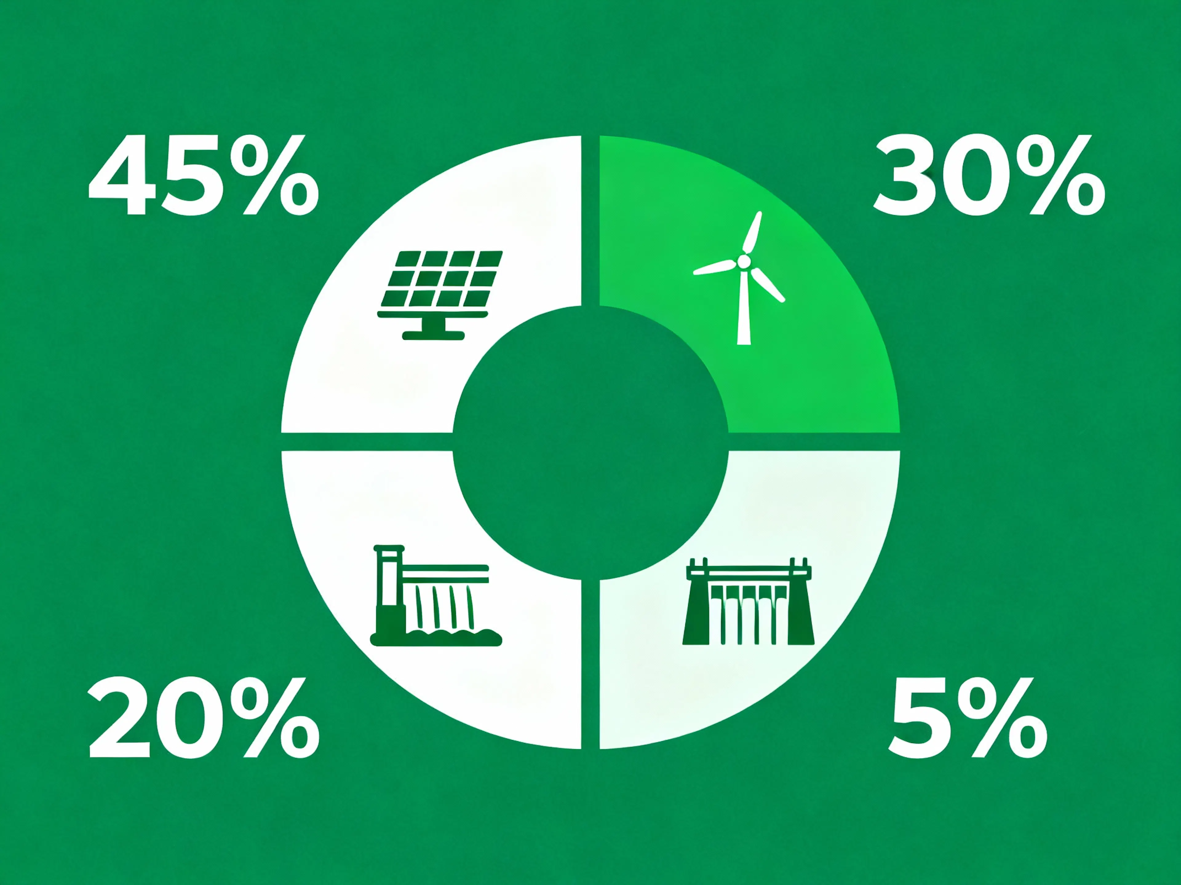
What works here:
Example 3: Social Media Banner
"Social media banner for fitness brand, headline 'TRANSFORM YOUR BODY' at top, fit person doing push-up on right side, bright orange and white colors, modern bold typography, call-to-action 'Join Now' button at bottom, energetic dynamic composition."

What works here:
Important Rules:
Step 3 – Refine Using Editing
Seedream generates an image in about 30–60 seconds. If the result is close but needs edits – use editing.
Instead of regenerating, simply say:
The system will understand what to change and apply changes to the existing design.
| Operation | Example Command | Result |
|---|---|---|
| Text Replacement | "Change 'Summer Sale' to 'Winter Festival" | Text changes, style and position preserved |
| Color Change | "Background from pink to navy blue" | Background color changes, elements remain |
| Style Transformation | "Convert to 3D cartoon illustration" | Entire style changes, layout preserved |
| Element Moving | "Move the logo to bottom right corner" | Position changes, size and look remain |
| Effect Addition | "Add glow effect to the text" | Effect added without other changes |
Tip: Iterate with editing, don't redo from scratch. Time saving – significantly.
Step 4 – Use Reference Images
If you want the result to match a specific palette, style, or composition, upload reference images.
How it works:
The system applies these parameters to your new design.
Usage examples:
Tip: Use references for consistency. If you need 10 banner variations for a campaign, upload the first successful version as a reference for the rest. All 10 will look like one collection.
A prompt is your instruction to the designer. If you write vaguely, the designer will guess what you mean. If you write structurally and clearly – the designer will create exactly what you asked.
Seedream works the same way. Here's how to write prompts that work.
Many people write prompts like a dream or poetry: "Beautiful sunset over the sea, seagulls flying, feeling of freedom..."
This doesn't work for Seedream. It needs a technical instruction: "Beach sunset scene, golden hour lighting, seagulls flying left, calm water with gentle waves, warm orange and pink sky, minimalist composition with horizon line at lower third."

Difference: The first prompt is figurative, vague. The second is specific, structural, with design parameters.
A good prompt for Seedream contains 6 key elements:
Start by specifying what you are creating. This sets the composition rules.
Examples:
✅ "Poster design for..." (correct, system knows how to structure) ❌ "Make something nice..." (incorrect, no context)
What should be the focal point? Describe it specifically.
Examples:
✅ "athlete jumping over digital barriers" (specific, visual) ❌ "sporty image" (vague)
Where should the text be? What size? What style?
Examples:
✅ "headline 'SUMMER SALE' at top center in bold white letters, small gray text 'Up to 50% off' below" (specific) ❌ "text somewhere" (incorrect)
What palette do you want? What atmosphere (bright, moody, neutral)?
Examples:
✅ "dark blue and cyan gradient background with neon accents" (specific) ❌ "nice colors" (incorrect)
How should it look? In what style?
Examples:
✅ "modern minimalist flat design with bold geometric shapes" (specific) ❌ "cool looking" (incorrect)
How are elements distributed? What is the composition direction?
Examples:
✅ "symmetrical vertical composition with elements centered, lots of negative space on sides" (specific) ❌ "nice layout" (incorrect)
Here is a universal template. Use it, and your prompts will work:
[IMAGE TYPE], [PRIMARY SUBJECT], [TEXT PLACEMENT AND CONTENT], [COLOR PALETTE], [STYLE/AESTHETIC], [COMPOSITION/LAYOUT]
Let's apply this formula to real projects.
One of the main features of Seedream 4.0 is non-destructive editing (natural language editing). This means you can change parts of a design without recreating everything from scratch.
This is revolutionary because it saves hours of work. Instead of generating 10 variants and choosing the best, you generate once and edit 9 times.
When you ask Seedream to change a specific element, the system:
Result: You get a new variant in 15–30 seconds without waiting for full regeneration.
Seedream supports many types of edits. Here are the main ones:
What you ask: "Change the headline from 'Summer Sale' to 'Winter Clearance'"

What happens:
Real example:
Tip: Use this for quick A/B testing of different slogans.
What you ask: "Change the background color from blue to burgundy"

What happens:
Tip: Use to adapt a design for different seasons, brands, or events.
What you ask: "Move the logo from bottom left to top right corner"

What happens:
System finds the logo.
Moves it to a new location.
The rest of the design reformats but remains harmonious.
No changes to logo size or style. Real example:
Original design: Poster with logo at bottom left.
Command: "Move the logo to the top right, keep it the same size."
Result: Logo in a new place, composition balance preserved.
Tip: Use for different formats (one design for a square post, another for vertical).
What you ask: "Convert this to a 3D illustration style, keep the same composition"
What happens:
Real example:
Tip: Use to create different variants of one design (realistic for print, flat for web).
What you ask: "Add a glow effect to the headline"

What happens:
Real example:
Tip: Use to enhance emotion or style.
What you ask: "Remove the background pattern, keep the solid color"

What happens:
Real example:
Tip: Use to simplify a design if the first version is too busy.
| Operation | Command | Result | Time |
|---|---|---|---|
| Text | "Change 'SALE' to 'OFFER" | Text updated, style preserved | 15–20 sec |
| Background Color | "Background from pink to navy" | Color changes, elements remain | 15–20 sec |
| Logo | "Move logo to top right" | Position updated, size preserved | 20–30 sec |
| Style | "Make it more minimalist" | Entire style redone, layout same | 30–45 sec |
| Effect | "Add shadow to text" | Effect added, text as before | 20–25 sec |
| Removal | "Remove background pattern" | Element removed, rest as before | 15–20 sec |
Imagine you are creating a product banner. Here's how the iterative process works:
Total time: 155 seconds (~2.5 minutes) instead of 30–60 minutes in Figma or Photoshop.
Edit if:
Regenerate from scratch if:
You already know how to use Seedream, write prompts, and edit. Now let's look at how to get outstanding results, not just good ones. These tips are based on the experience of designers and marketers who work with Seedream daily.
Be Explicit About Layout Directions
One of the main mistakes is just describing the object, forgetting about the layout.
❌ Incorrect: "Design a poster for a tech conference with speakers and stage." ✅ Correct: "Poster design for tech conference, prominent stage in center with three speakers on it, headline 'INNOVATION SUMMIT 2025' at top in bold letters, speaker names and roles below, dark modern background, vertical composition with stage as focal point."
Why it's important: Seedream understands layout deeper than just objects. When you explicitly specify what should be in the center, what's on the edges, what the hierarchy is – the result is more professional.
Practical tip: Think like a designer on paper. First decide where the headline is, where the main content is, where secondary elements are. Then write the prompt.
Avoid Long Text
Seedream handles short headlines and slogans well. But paragraphs of text often come out unreadable.
❌ Incorrect: "Infographic explaining the benefits of renewable energy including cost savings, environmental impact reduction, and long-term sustainability for future generations." ✅ Correct: "Infographic about renewable energy, three icons: dollar sign with '70% savings', leaf with 'zero emissions', sun with 'sustainable future', clean typography, minimal text."
Why it's important: The system works better with visual elements (icons, charts) and short labels than with descriptive texts.
Practical tip: If you need long text, create the design in Seedream, then add the text in Figma or Photoshop.
Use Reference Mode for Consistency
If you need to create a collection of designs in a unified style, use the first successful result as a reference.
Example workflow:
Result: 4 designs in a unified style, instead of searching for style each time.
Practical tip: Save a "master design" for each project. Then use it as a standard for all variants.
Test Different Styles on One Subject
Don't try to choose the perfect style on the first try. Better to quickly generate several variants and choose.
Example:
Why this works: Different styles suit different audiences. What you like may not appeal to your target audience. Testing helps find the optimum.
Practical tip: Dedicate 5 minutes to testing styles before starting serious edits.
Use Negative Space Consciously
Professional designs often look "breathable" thanks to empty space (negative space). Seedream understands this.
❌ Incorrect: "Poster with everything covering the entire space, no empty areas." ✅ Correct: "Poster with plenty of negative space on sides, subject centered, minimal text, lots of breathing room around elements, clean uncluttered composition."
Why it's important: Negative space not only looks beautiful – it makes design more professional and readable.
Practical tip: Add words to prompts: "lots of white space," "breathing room," "minimal elements," "clean composition."
Specify Aspect Ratio
If you are creating a design for a specific platform, specify the aspect ratio. This will help Seedream optimize composition.
Examples:
❌ Incorrect: "Design a social media post." ✅ Correct: "Design an Instagram post (square 1:1 format), headline centered, call-to-action at bottom, vibrant colors, mobile-optimized composition."
Practical tip: Always specify the format in the prompt. This gives the system a clear instruction.
Use Color Psychology
Different colors evoke different emotions. Use this consciously.
Practical tip: Before writing a prompt, decide on the emotion you want to evoke. Then choose the colors that evoke it.
Don't Overcomplicate From the Start
Better to start with a simple design and add details than to start with a complex one and simplify.
Example iteration:
Result: You see at which stage the design starts to look better.
Practical tip: Start with the minimum, then add layers.
Combine Seedream with Other Tools
Seedream is not an alternative to Figma or Photoshop – it's a complement.
Optimal workflow:
Instead of:
Creating everything from scratch in Figma (45–60 minutes)
Practical tip: Use Seedream for visual foundations, Figma/Photoshop for final touches.
Study Prompts That Work
When you create a successful design, save the prompt in the cloud or a document. This is your personal database of best examples.
Practical tip: In a month, you'll be generating designs 3 times faster because you'll reuse proven prompts.
Edit, Don't Redo
This isn't just a tip – it's a change in mentality.
❌ Old approach: "Result isn't perfect → I'll generate a new one." ✅ Correct approach: "Result is close → I'll edit individual parts."
Time saving: 5–10 times. Practical tip: Before clicking "Generate," ask yourself: "Can I edit this?"
Use A/B Testing for Selection
If you need to choose between two directions, generate both and see which works better.
Example:
Then:
Practical tip: Seedream allows quick generation, so testing is now more accessible.
In 2025, there are several AI tools for creating design. But they solve different problems and suit different purposes. Let's understand how Seedream differs from competitors.
In this comparison, we'll look at five main tools:
| Criterion | Seedream 4.0 | Midjourney | DALL-E 3 | Magic Hour | Canva AI |
|---|---|---|---|---|---|
| Typography | ⭐⭐⭐⭐⭐ | ⭐⭐ | ⭐⭐⭐ | ⭐⭐⭐ | ⭐⭐⭐ |
| Layout/Composition | ⭐⭐⭐⭐⭐ | ⭐⭐⭐ | ⭐⭐⭐ | ⭐⭐⭐ | ⭐⭐ |
| Publish-readiness | ⭐⭐⭐⭐⭐ | ⭐⭐ | ⭐⭐⭐ | ⭐⭐⭐⭐ | ⭐⭐⭐ |
| Generation Speed | ⭐⭐⭐⭐ | ⭐⭐⭐ | ⭐⭐⭐⭐ | ⭐⭐⭐⭐ | ⭐⭐⭐⭐⭐ |
| Editing | ⭐⭐⭐⭐⭐ | ⭐⭐ | ⭐⭐ | ⭐⭐⭐ | ⭐⭐⭐ |
| Price | 💰💰 | 💰💰💰 | 💰💰 | 💰💰💰 | 💰 |
| Learning Curve | Medium | Low | Low | Medium | Very Low |
| Result Quality | ⭐⭐⭐⭐⭐ | ⭐⭐⭐⭐ | ⭐⭐⭐⭐ | ⭐⭐⭐⭐ | ⭐⭐⭐ |
Seedream 4.0 is not just another AI generator. It's a professional tool that understands design rules, typography, composition, and layout. It's a tool for those who want to create publish-ready assets, not inspiring drafts.
Seedream specializes in structural design. Posters, infographics, banners, marketing visuals – this is its territory. Here it is better than Midjourney, DALL-E, and most competitors.
Non-destructive editing saves hours. Instead of generating 10 variants, you generate once and edit 9 times. Time saving is significant.
Typography and composition work professionally. Seedream creates readable text and balanced layouts. This distinguishes it from other AIs.
Integration into the workflow is simple. Seedream works as a standalone tool or a complement to Figma/Photoshop. No complex integration is needed.

Max Godymchyk
Entrepreneur, marketer, author of articles on artificial intelligence, art and design. Customizes businesses and makes people fall in love with modern technologies.